This post has been read 1631 times!
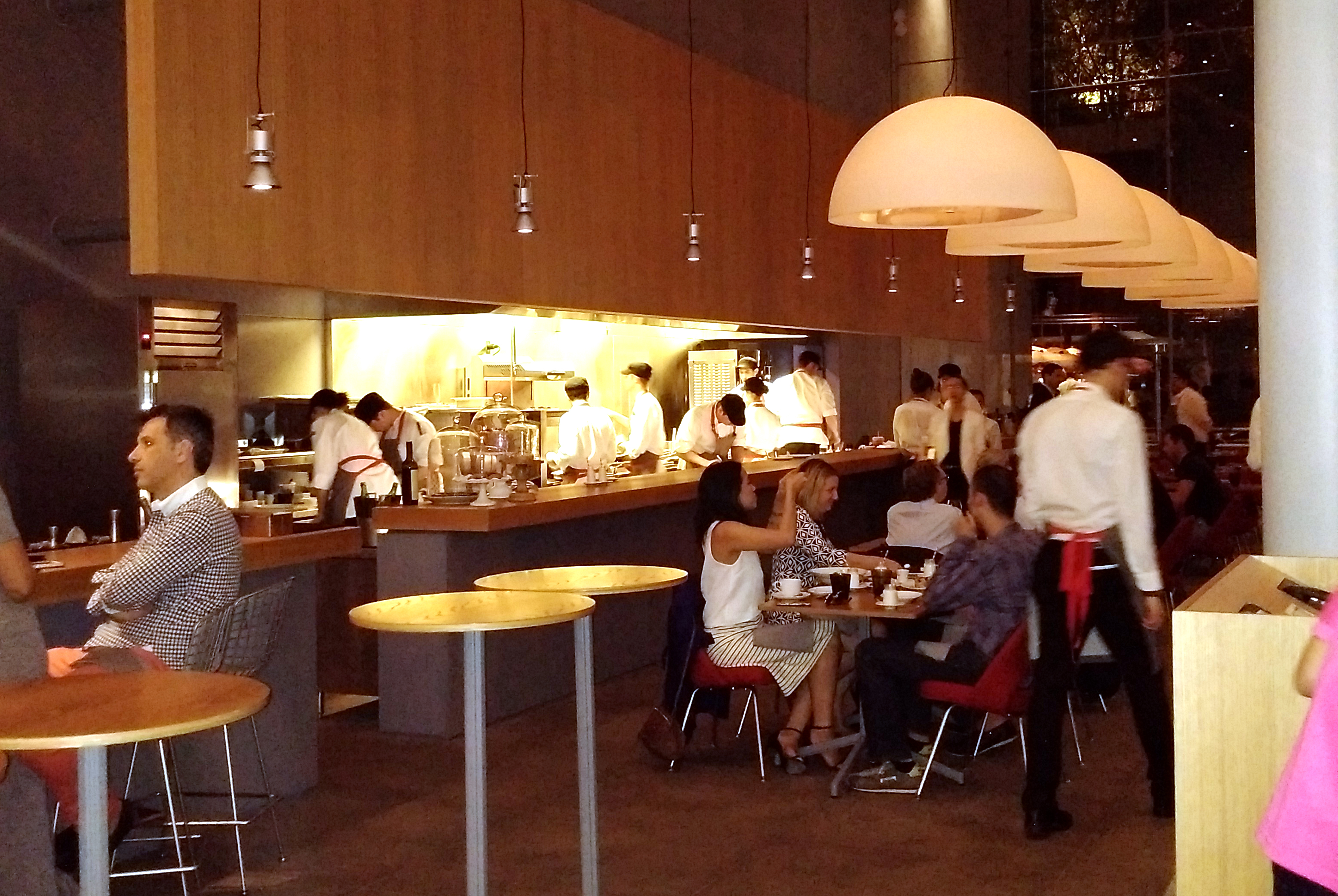
 September 9, 2015- The NYT posted a story about how New York restaurants are too loud. They used Danny Meyer’s “Untitled” in The Whitney as their case in point.
“From the outside, Untitled looks like one of those places where intimate conversation gets lost in the din.
The restaurant, which anchors the architect Renzo Piano’s new home for the Whitney Museum of American Art in the meatpacking district, has all the makings of a cacophony box. The primary walls are glass. That back wall is concrete. The floors? Blue Catalan limestone. The cooks chop and sear in an open kitchen, and the tables don’t have tablecloths.
“Obviously acoustics were an issue,” said Toby Stewart, an architect from Mr. Piano’s organization, who worked on the space with Danny Meyer’s Union Square Hospitality Group. That’s because the room is a riot of hard surfaces, which amplify noise. And there aren’t a lot of fabrics to soak it up.”
Review: “Untitled” at the Whitney
Pete Wells slams Danny Meyer’s Untitled but gives it 2-stars anyway
